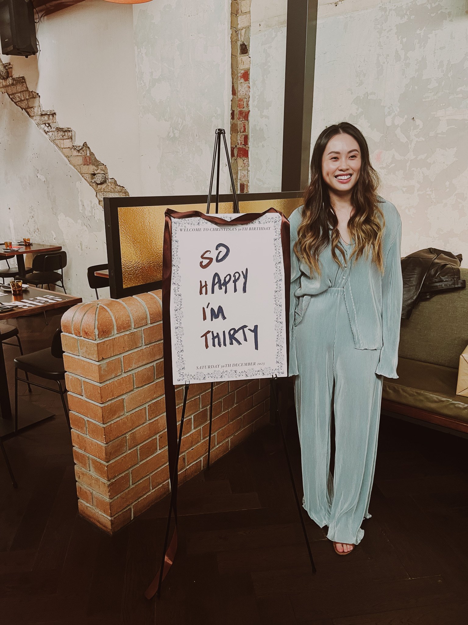

Being given complete freedom to curate and design pieces for an event can be overwhelming, but I find it incredibly exciting to pull together a vision that suits both the individual and the space.
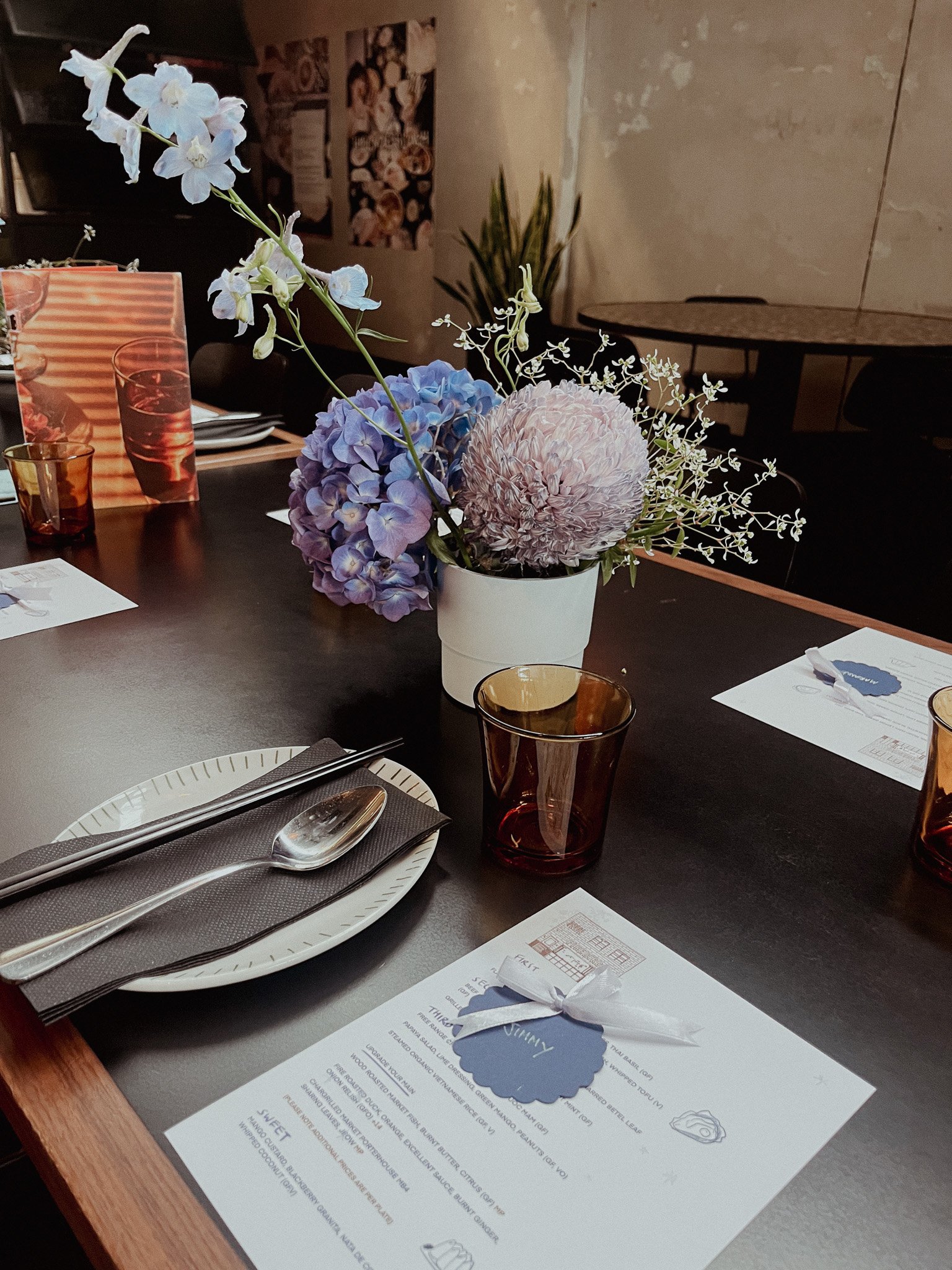
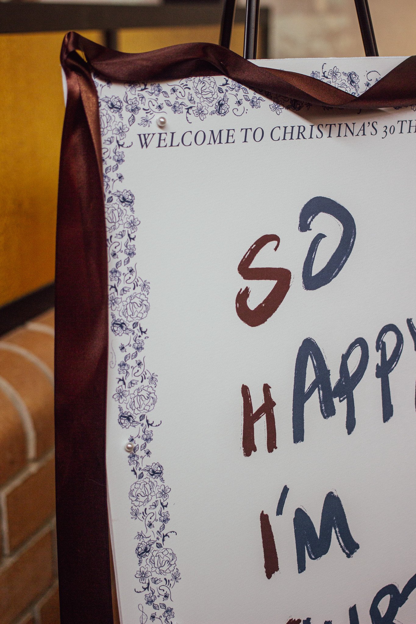
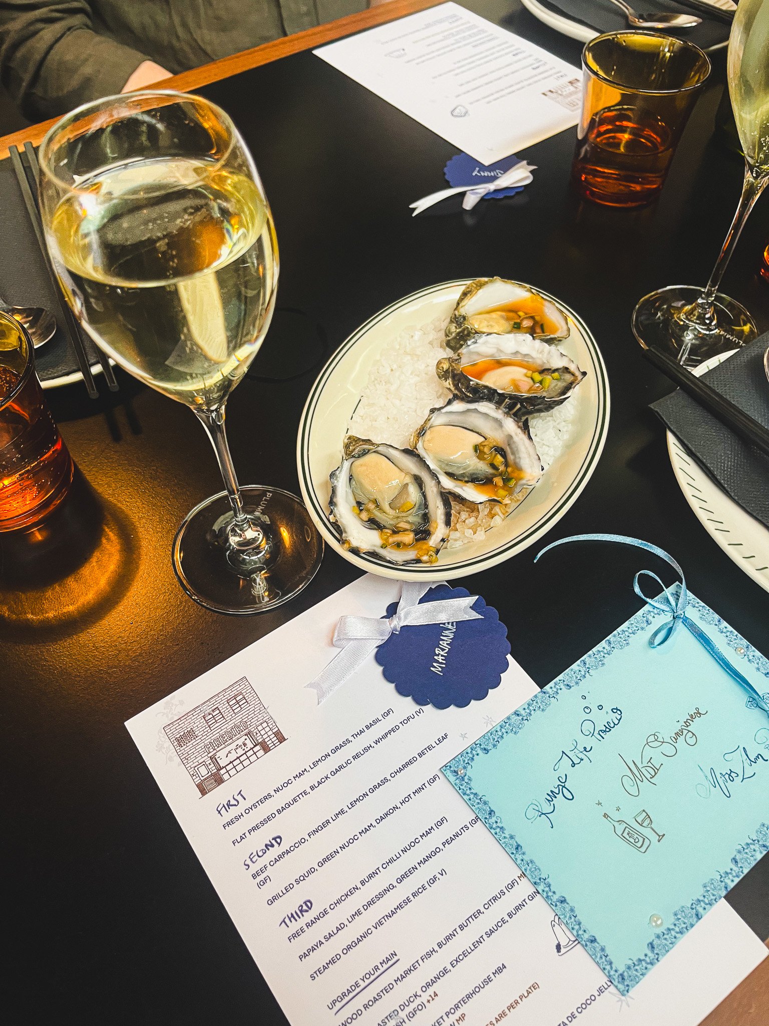
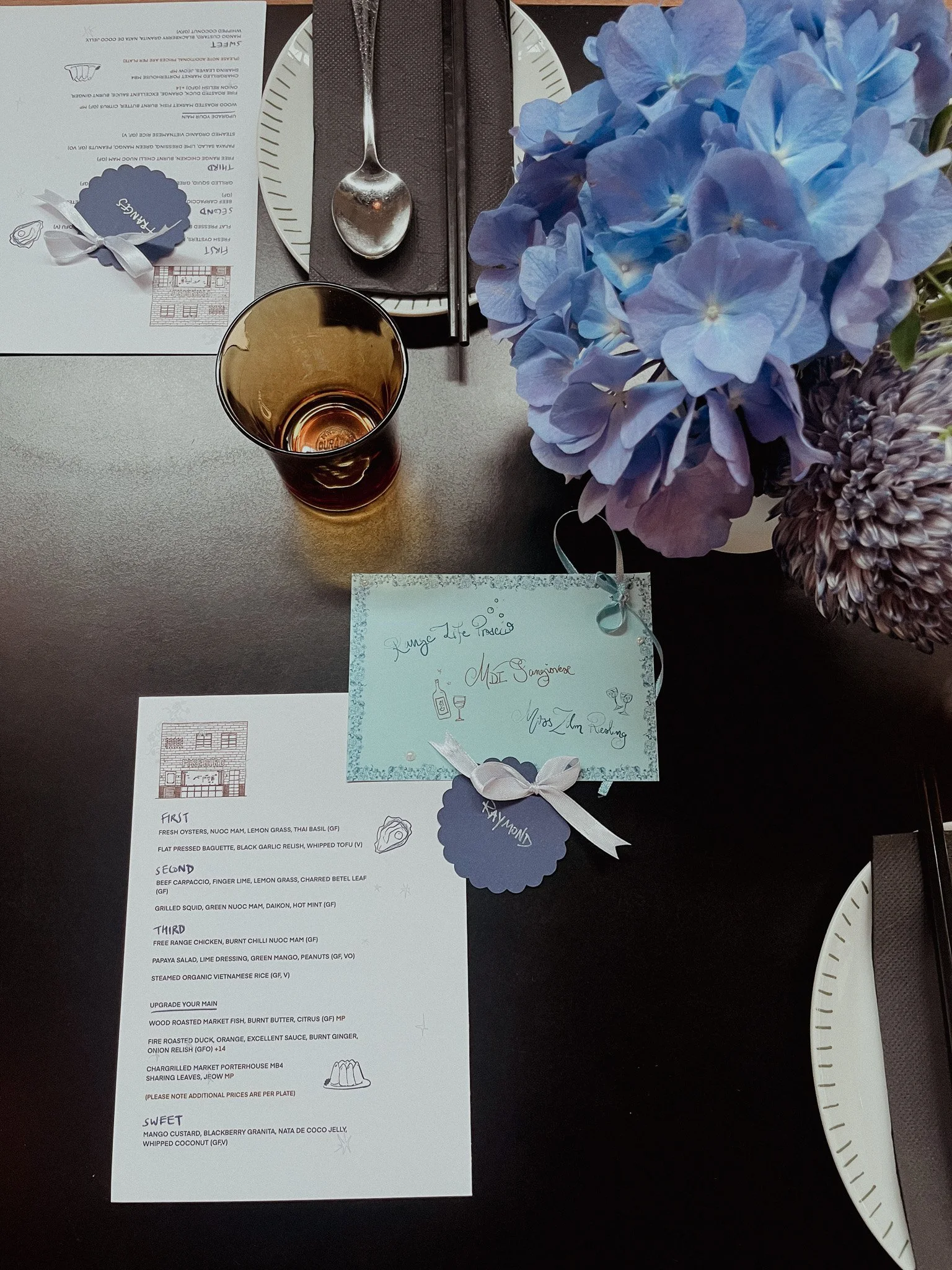
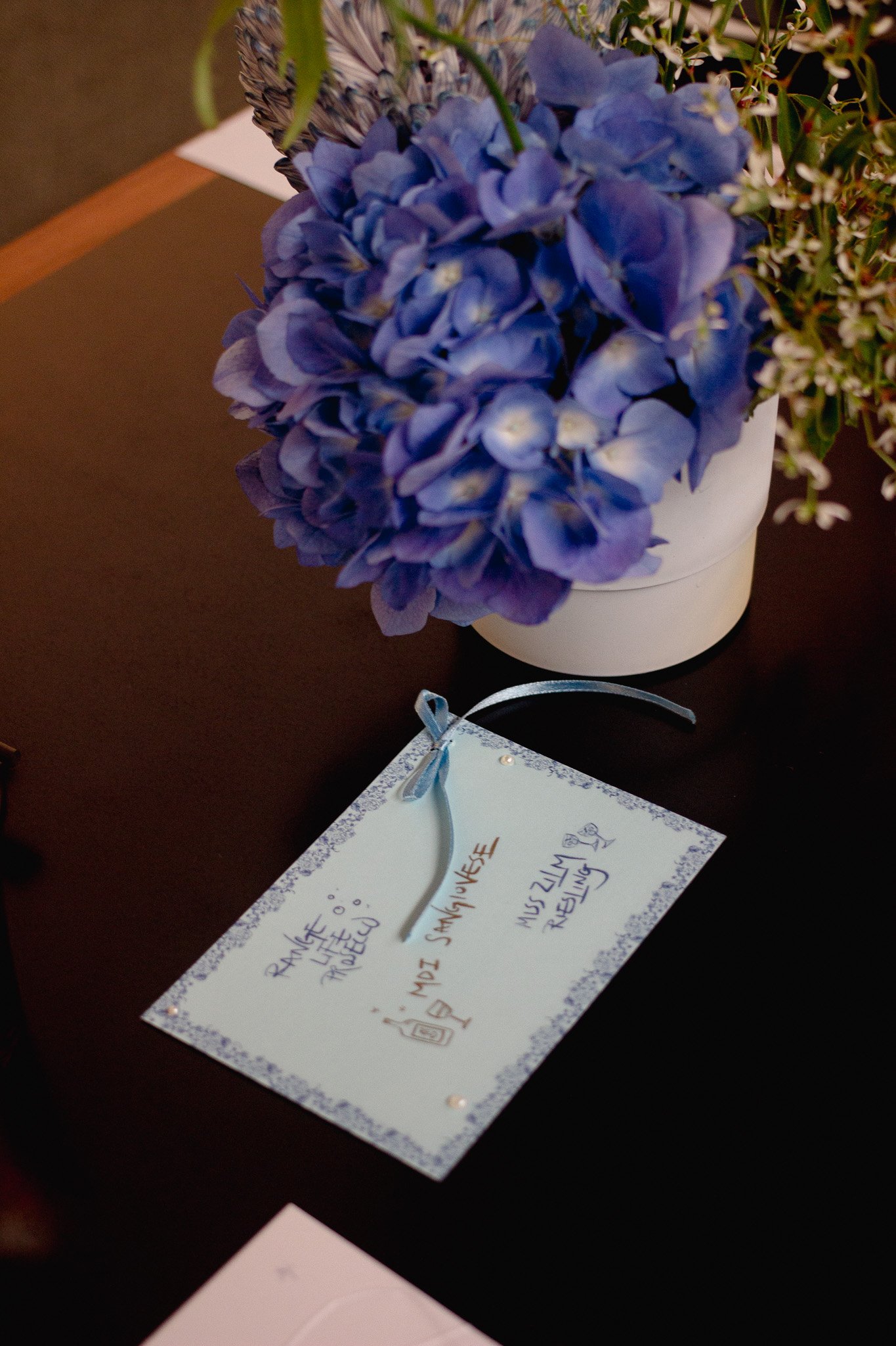
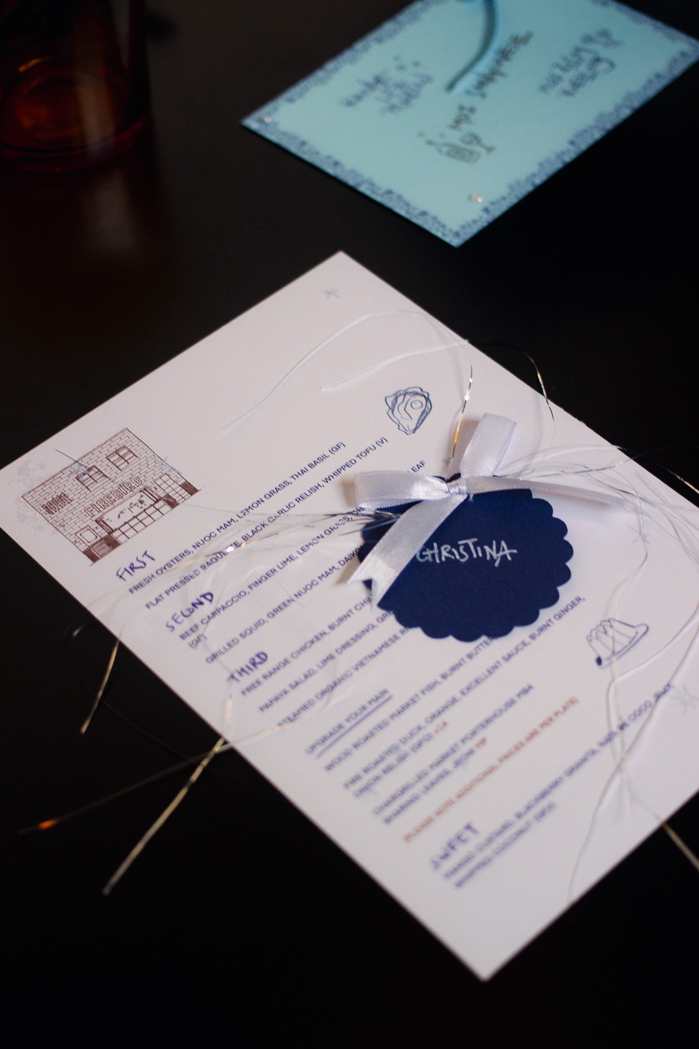
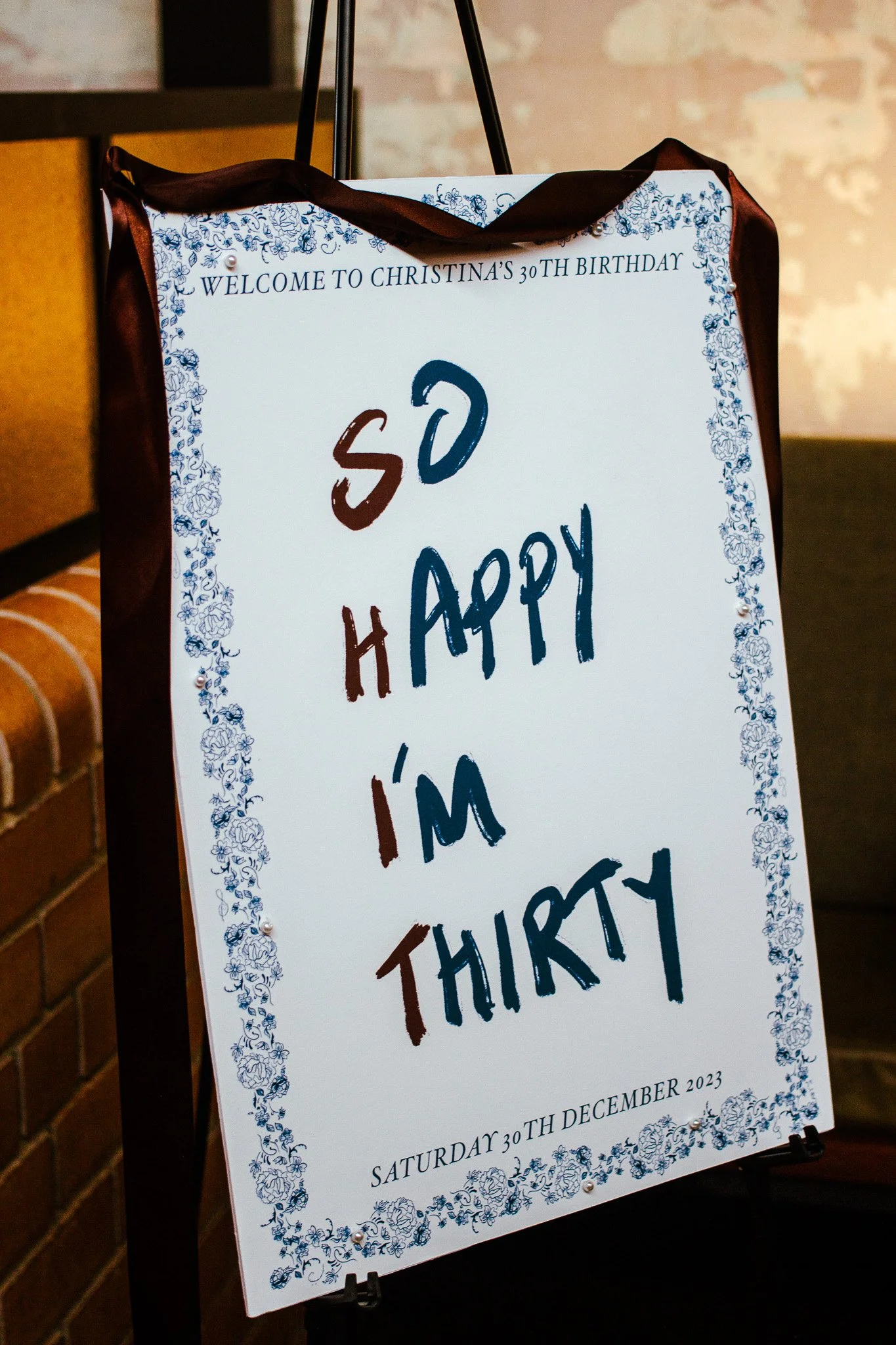
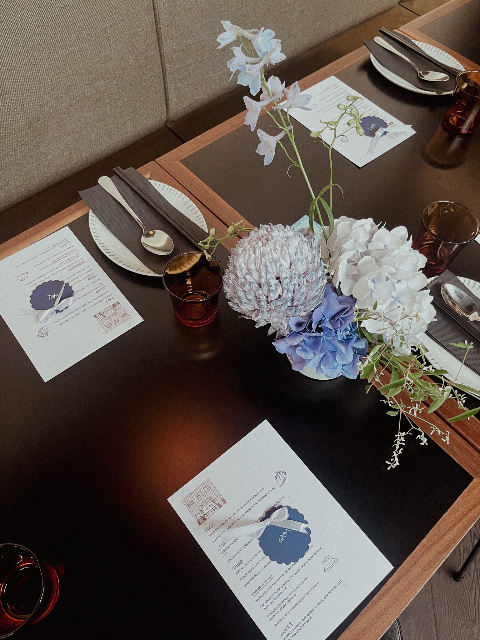
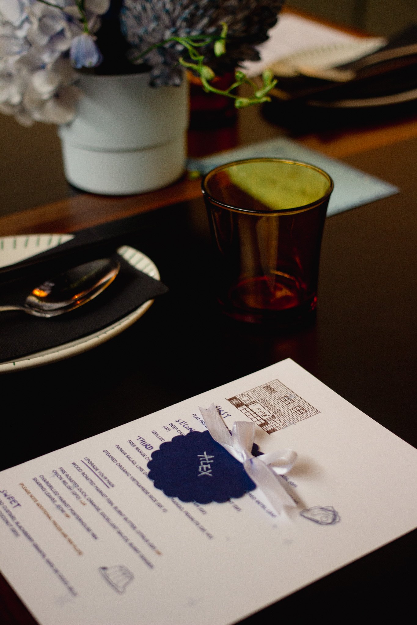
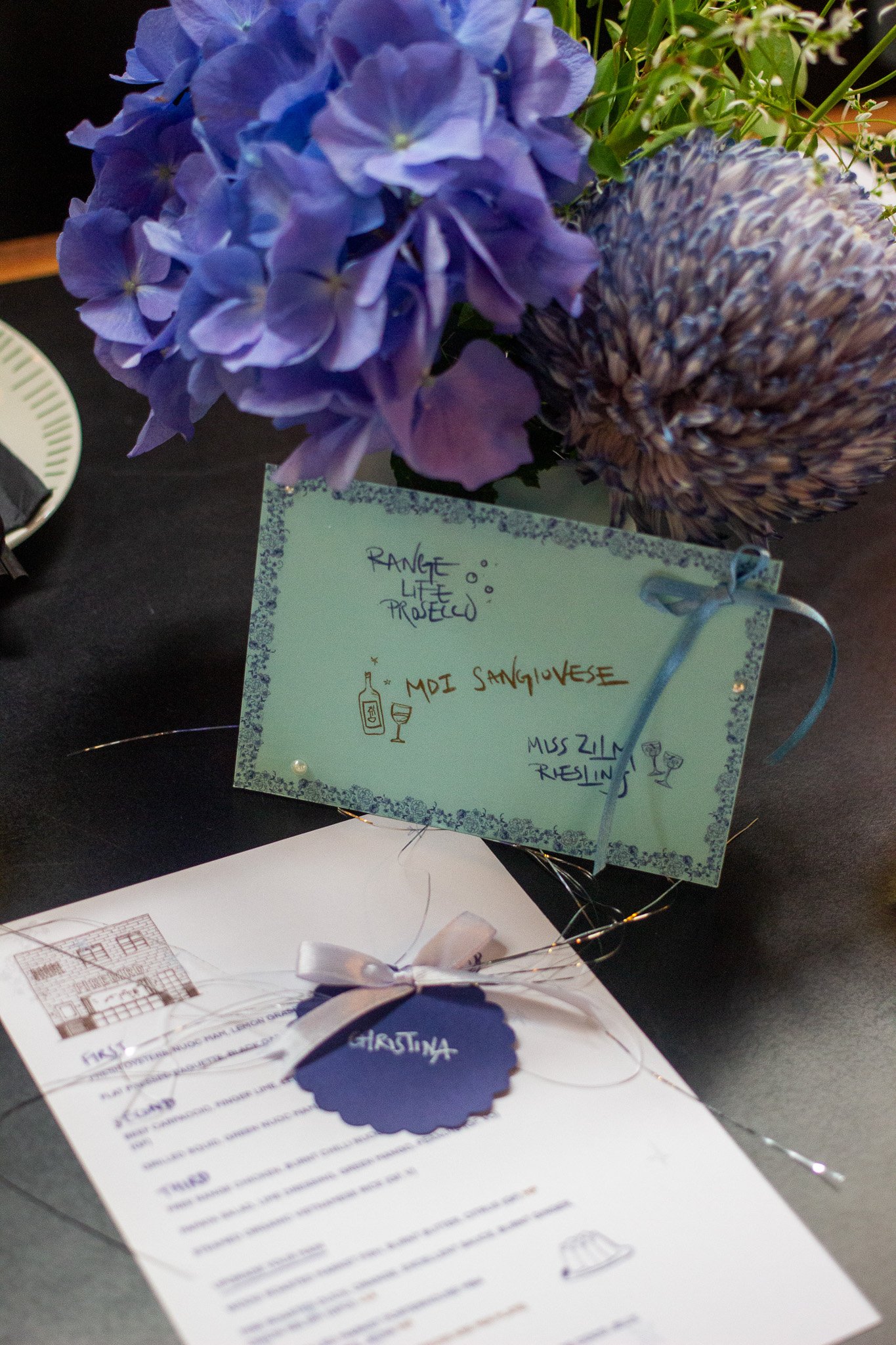
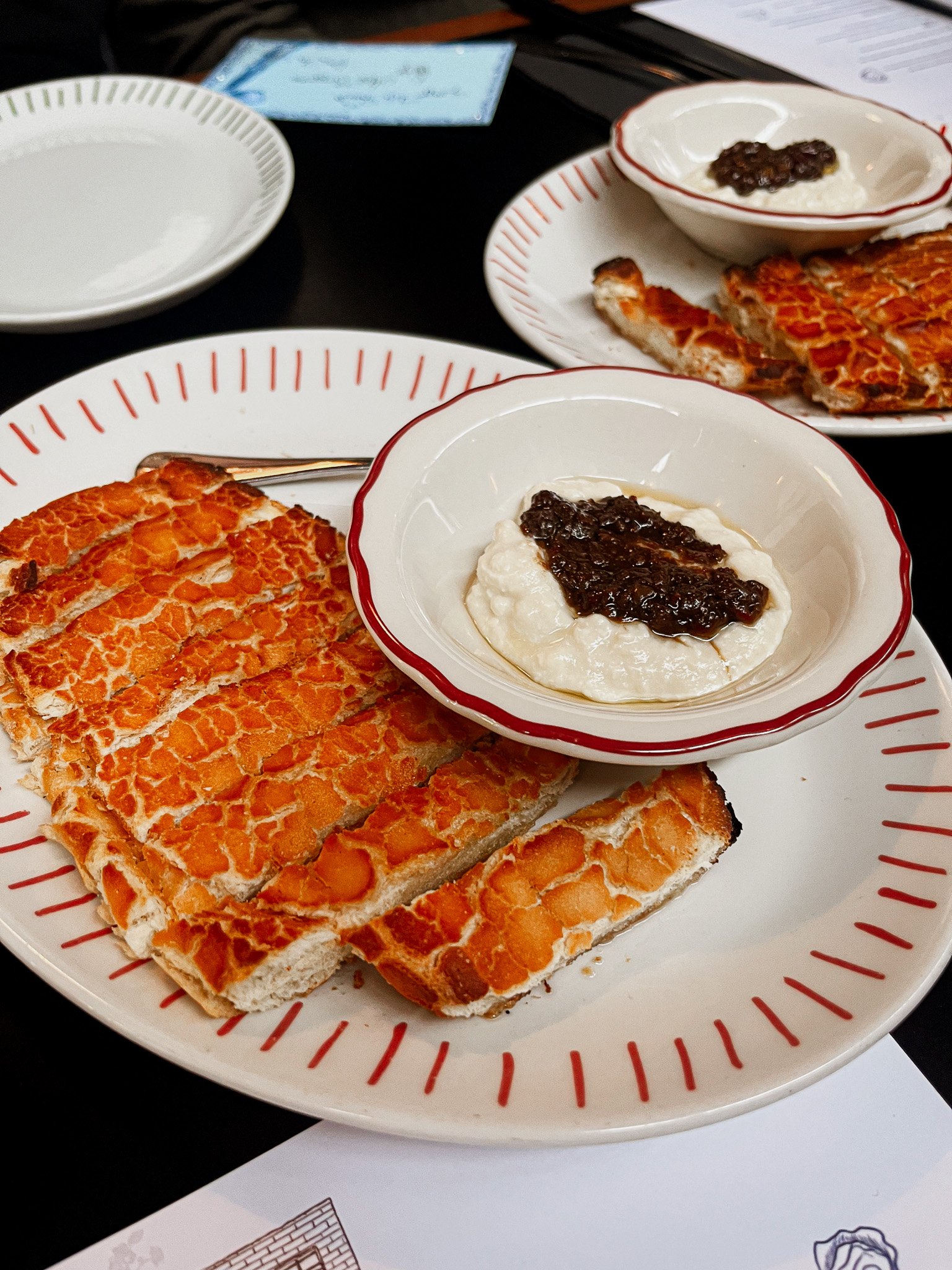
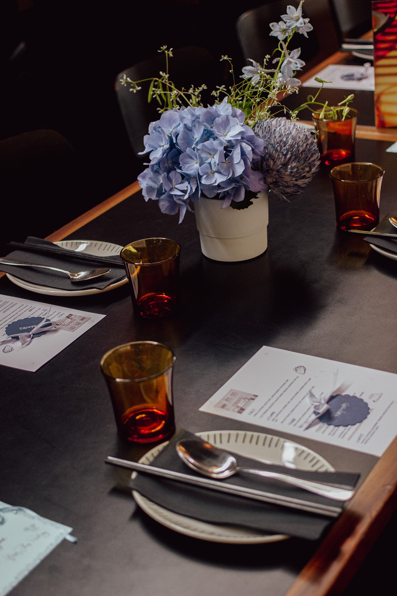
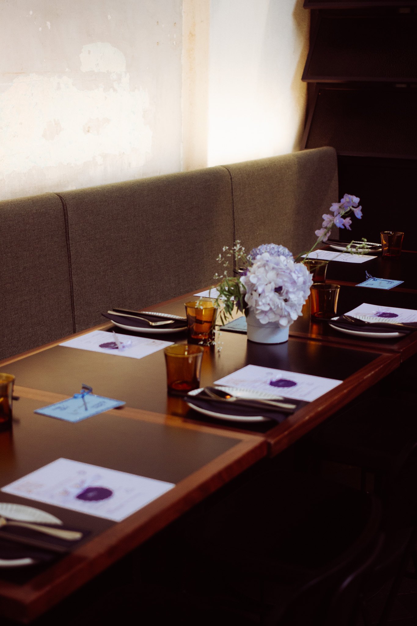
Firstly, I start with a color palette, then head straight to Instagram and Pinterest to capture the desired 'vibe.' Knowing that Christina's favorite color is blue, I contemplated how to incorporate it into the atmosphere and space of the venue (in this case, Firebird) while reflecting her personality. Initially, I considered illustrating icons to represent her hobbies, but after some thought, I decided it wasn't the right fit. Fortunately, a few weeks of brainstorming later, I recalled her love for Chinese music and television dramas. This inspired the Chinaware-inspired border! Now, the challenge was to match this with the restaurant's aesthetic. Challenge accepted! I enjoy a bit of juxtaposition, so I thought the perfect contrast between the feminine and delicate would be something edgy and fun. Brown seemed like the ideal choice, complementing both the space and the acronym "S.H.I.T" (which, by the way, I found a bit humorous – others noticed the color reference too, much to my delight). Completed with hand-sewn pearls, a brown ribbon accent, and, of course, bows! The matching glassware turned out to be a happy coincidence.